top of page

Creative Direction

That idea you’re almost afraid to pitch? Let’s explore it.

Twenty shots, one idea, and somebody has to keep them from drifting apart. Creative direction at Garbanzo connects your brief to the concept, visual point of view, and decisions that make the work hold together. Bring an open creative question or a direction you've already set. We can develop the approach with you, carry it through a Garbanzo production, or hand the direction to your team to execute.

Trusted by the world's top companies:

  • Working from a strong brief but still looking for the idea.

  • Choosing between visual directions and need a clear reason to back one.

  • Developing a concept your client or internal team needs to see before approving.

  • Bringing several pieces together and want them to feel like the same campaign.

You're in the right place if you're:

Let’s see what that idea is made of

Creative direction services

Creative strategy

Why this idea, for this audience, on these channels: the connective thinking between your brief and our boards.

Concept development

The idea before the artwork: territories, references, and the one-line thought a whole campaign can hang on. The aim is a direction your creative team can judge and your decision-makers can understand before production begins.

Art direction

The look, decided and defended: type, color, light, texture, and the rules that keep them coherent across every deliverable.

Add a Title

FAQ

Featured Projects

<p class="font_8" style="text-align: left">Garbanzo created animated educational videos for a teen audience as part of an ongoing relationship with RethinkEd. The work followed the client’s requirements through storyboards, styleframes and animation, with visual planning and the finished sequences developed as parts of the same production. The portfolio examples use characters, symbols and simple situations to give abstract ideas a visible form.</p>
<p class="font_8"><br></p>
<p class="font_8" style="text-align: left">The visual range includes textured imagery, spare icon-based scenes, colorful geometric characters and hand-drawn figures. Each approach gives the learning material a different visual character. Garbanzo’s scope also included selecting and recording voice talent, editing the videos, and bringing in sound effects and stock music to complete the pieces.</p>

Kids Education Videos with RethinkEd

<p class="font_8" style="text-align: left">Arch Public’s motion-branding project takes a geometric visual language into movement. The presentation brings together logo reveals, animated wireframe shapes and applications in layouts ranging from lower thirds to large displays. Blue, navy and white connect the elements, giving the logo and supporting graphics a recognizable family resemblance.</p>
<p class="font_8"><br></p>
<p class="font_8" style="text-align: left">The development material shows the decisions behind that family: alternative storyboard directions, logo-animation studies and supplied flat graphics compared with animated 3D interpretations. Arches, ribbons, stairs and stacked forms become individual motion elements, shown both on their own and within layouts. Together, they explore how the brand’s geometric language can move across different compositions.</p>

Arch Public Motion Branding

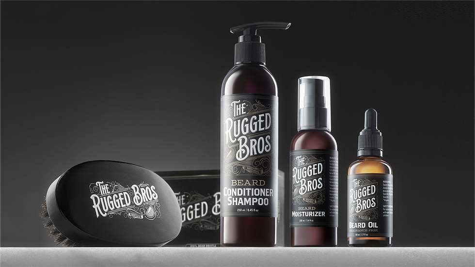
<p class="font_8" style="text-align: left">The Rugged Bros needed a brand that could travel from the product in someone’s hand to the storefront where they bought it. Beginning in 2016, Garbanzo helped create and launch the new grooming brand, bringing creative direction, product and package design, photography and commerce work into one coordinated assignment. Ornamental lettering, dark packaging and warm gold tones give the range a shared visual identity.</p>
<p class="font_8"><br></p>
<p class="font_8" style="text-align: left">Product photographs make the brushes, bottles and boxes clear, while lifestyle imagery places them in a different, more personal setting. Shopify and Amazon-related storefront work carries the same identity into the buying experience. The original scope also included sourcing, manufacturing and fulfillment coordination, making this a broader brand-launch project whose visual work can be seen across both physical and digital applications.</p>

Rugged Bros Brand & Products

<p class="font_8" style="text-align: left">An established New York construction company needs an identity that works wherever the business is seen. Seneca approached Garbanzo in 2019 for a brand refresh developed with Carlo Seneca. The work brought a geometric cube emblem, strong typography and a red-and-black palette into a coordinated family of brand applications for the hospitality-focused contractor.</p>
<p class="font_8"><br></p>
<p class="font_8" style="text-align: left">The identity moves from metal business cards and apparel to graphics on a red Kenworth T880 truck. Motion examples extend the cube mark into rotation and unfolding, while desktop and mobile website demonstrations show the brand in a digital setting. These different scales make the project distinctive: the same visual language has to remain recognizable on a small printed piece and a vehicle seen on a New York street.</p>

Seneca Brand & Web Development

<p class="font_8" style="text-align: left">Arch Public asked Garbanzo to turn its Bitcoin Arbitrage Algorithm into a 30-second 3D promo. Our concept, an “AI nerve center,” gave the software a visual presence: a dark control room of floating interfaces, charts and illuminated pathways, active while the film’s user sleeps. That visual metaphor supplied a distinctive world for the product story.</p>
<p class="font_8"><br></p>
<p class="font_8" style="text-align: left">Garbanzo developed the concept, creative direction, design and animation. Trading graphics tie the imagined environment to the product, while purple and blue light connect the interface details to the larger scene. The selected frames and standalone UI clips show both scales of the work: an overall promotional world and the smaller animated elements that give it its character.</p>

"Money Never Sleeps"

<p class="font_8" style="text-align: left">This project began with a technical diagram and grew into a more expressive product sequence. The Cookware Company asked Garbanzo to visualize layered cookware construction: metal layers combining, an etched pattern appearing and coatings forming across the surface. As the scope expanded, camera movement and richer materials gave the explanation more room to work as product imagery.</p>
<p class="font_8"><br></p>
<p class="font_8" style="text-align: left">The process included styleframes, environment studies and separate development of a fully CG egg slide. Reflective metal, close surface detail and the egg’s movement each needed their own visual tests before they could sit together in the sequence. The selected material shows both the technical construction and the cooking imagery, with experiments and unfinished tests presented alongside the more finished work.</p>

GreenPan Spectra

<p class="font_8" style="text-align: left">When the Aries Grid container changed, its visualizations needed to change with it. Garbanzo updated the enclosure model from the earlier ONE project, carrying the revised form into interior views, system layouts and environment scenes. The work keeps the product recognizable across close component views and the larger settings used to explain its place in an energy-storage system.</p>
<p class="font_8"><br></p>
<p class="font_8" style="text-align: left">The revised enclosure appears in illustrated applications that include solar infrastructure, a hospital setting and nighttime storage arrays. Updated isometric imagery connects it with the surrounding power network. These product and use-case visualizations carry the revised geometry across the different scales of the presentation.</p>

Aries Grid (Updated)

<p class="font_8" style="text-align: left">Aries Grid needed to be shown at more than one scale. Garbanzo worked with Our Next Energy on a 3D explainer and supporting visualizations of its utility-scale battery-storage system, moving from the details inside the battery enclosure to the industrial and renewable-energy settings around it. The creative task was to keep those views visually connected while making each scale useful to the explanation.</p>
<p class="font_8"><br></p>
<p class="font_8" style="text-align: left">Detailed racks, cabling and interior camera moves bring the engineered product into focus. Photoreal environments and isometric diagrams then place it within a wider power network, while aerial site imagery shows a proposed facility in context. The portfolio also includes styleframes, unfinished development views and presentation examples, so the finished product imagery can be read alongside the work that shaped it.</p>

Aries Grid

<p class="font_8" style="text-align: left">FIS’s New Now Next presentation needed a graphic system that could keep moving through an extended virtual program. Garbanzo created background-panel animation, title cards and supers for a presentation described in the original brief as roughly 50 minutes long. Multiple screens and geometric set elements appeared in different camera framings, so the graphics had to work together while accommodating the presenters.</p>
<p class="font_8"><br></p>
<p class="font_8" style="text-align: left">Reusable background loops established the visual language, with green, teal and cyan lines, particles and geometric forms carrying it across the set. Expression-driven title templates adjusted their animation to the amount of text entered. That approach made the many title and panel applications manageable within a consistent design system, rather than requiring a separate animation setup for every line of copy.</p>

"New Now Next"

<p class="font_8" style="text-align: left">Dentsu America came to Garbanzo with a UNIQLO promotion and a six-day animation deadline. Wonderqube turned a mystery-prize idea into a clean red-and-white world of moving boxes, with a 30-second brief that needed to carry the brand’s minimal, playful character. Dentsu had seen Garbanzo’s MTV graphics and brought that motion-design experience into the assignment.</p>
<p class="font_8"><br></p>
<p class="font_8" style="text-align: left">The concept went through several cube arrangements before taking inspiration from the Alamo sculpture at Astor Place. Garbanzo worked with Dentsu in Cinema 4D and After Effects, animating mapped cubes into a larger formation that assembles and opens to reveal prizes. Bright, controlled lighting connects the 3D world to the clarity of UNIQLO’s retail imagery.</p>
<p class="font_8"><br></p>
<p class="font_8" style="text-align: left">The visual system continued beyond the film into point-of-sale screens, signage and digital graphics for mobile, Facebook and the retail website. This portfolio brings those applications together with styleframes and making-of material, so the promotion can be seen as both a finished visual idea and a set of related design decisions.</p>

UNIQLO "Wonderqube"

<p class="font_8" style="text-align: left">Raúl Juliá: The World’s a Stage follows the actor’s career from Puerto Rico to New York, Broadway and Hollywood. Directed by Ben DeJesus and broadcast on PBS in 2019, the documentary supplies the context for the graphics presented here. The portfolio reel combines archival portraits, photographs, paper textures and title imagery in a treatment shaped around the film’s historical material.</p>
<p class="font_8"><br></p>
<p class="font_8" style="text-align: left">Layered compositions and film-strip details give the still imagery movement while retaining its archival character. Warm paper and monochrome photographic treatments connect the individual images into a consistent graphic world. The reel offers a close view of these design and animation samples from the documentary.</p>

"Raúl Juliá: The World’s a Stage"

Related specialties

Commercials & Ads

Add paragraph text. Click “Edit Text” to update the font, size and more. To change and reuse text themes, go to Site Styles.

Product Technical Videos

Add paragraph text. Click “Edit Text” to update the font, size and more. To change and reuse text themes, go to Site Styles.

VFX Shots Sequences

Add paragraph text. Click “Edit Text” to update the font, size and more. To change and reuse text themes, go to Site Styles.

Brand Packages

Add paragraph text. Click “Edit Text” to update the font, size and more. To change and reuse text themes, go to Site Styles.

Broadcast Design Packages

Add paragraph text. Click “Edit Text” to update the font, size and more. To change and reuse text themes, go to Site Styles.

Out of Home Experiential

Add paragraph text. Click “Edit Text” to update the font, size and more. To change and reuse text themes, go to Site Styles.

FAQ

What does the concept phase look like?

Do you offer creative direction as a standalone service?

Have a brief that needs a point of view?

Bring us the problem before the solution. That's the fun part.

bottom of page